Giving is up!
That’s the great news we’re hearing all over.
AND . . . more and more people will be making their gifts online.
There’s a lot of money in play for deserving nonprofits in these last two weeks of the year.
But be careful – there are also many donors who will visit your site but fail to complete their gift.
Here are my quick and dirty tips to help you capture the hearts . . . and the gifts . . . . of lovely donors who visit your website at year end:
1. Set your donation page to be the main landing page for your website.
All the smart online nonprofits do this. So when a donor googles your organization, what pops up first?
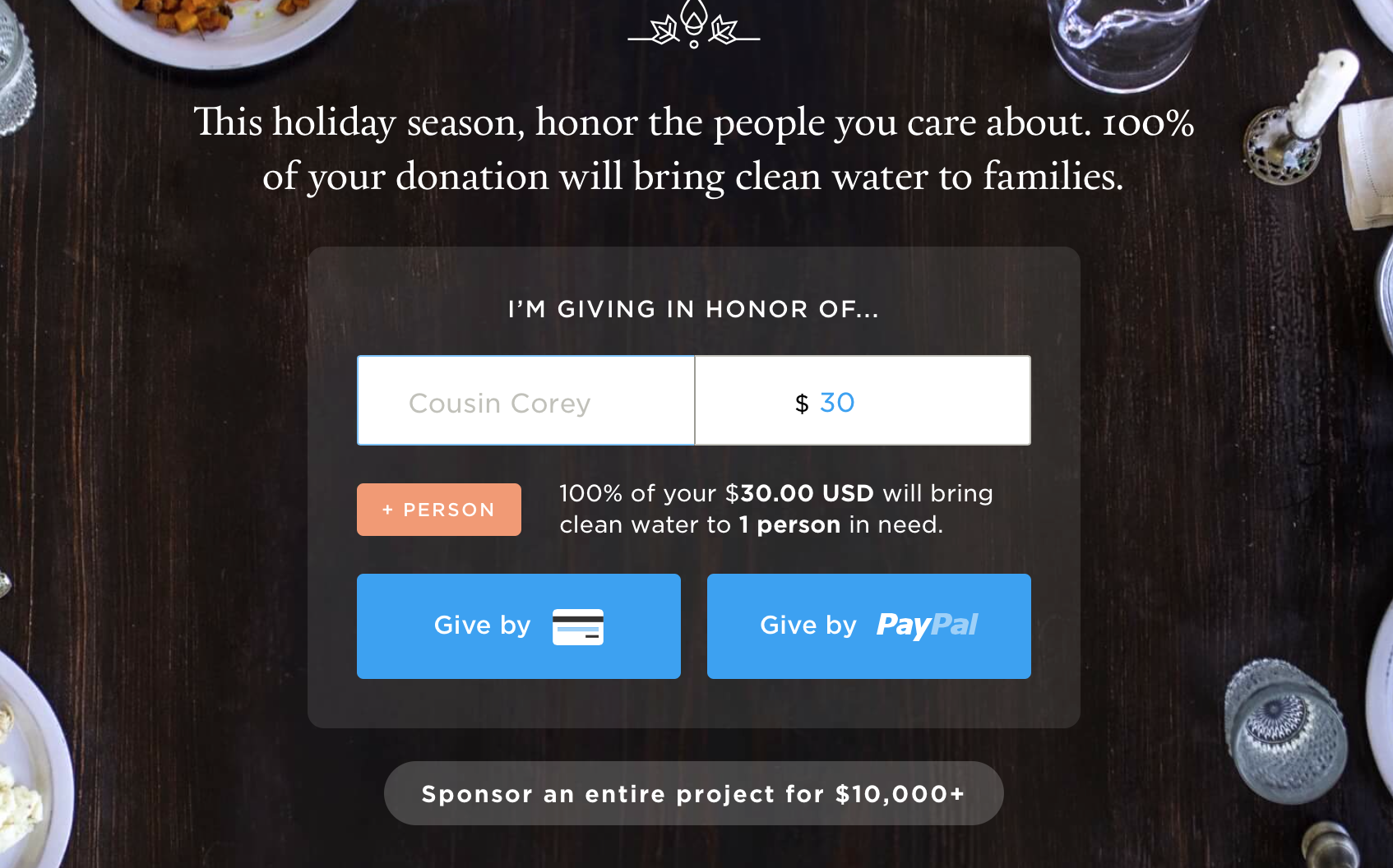
Look what happens when you google Charity: Water – it’s a donation page, not a “home” page:
Here is the landing page for CharityWater. It’s really a donation page!
When your donor googles you – does she see your overly complex home page where she has to HUNT for the link to donate?
or —
Does she first see your actual donation page that is popping up first?
Just think – anyone who visits your site the last 2 days of the year is probably there for only one reason: to make a generous gift.
So be smart. Take down that complicated home page for just two days – December 30 and 31.
Or take it down for the entire next two weeks like Charity: Water does.
Make it easy for your donor.
Urge her to join in the cause right there up in front.
Don’t make your donor work to make her gift to you!
2. Put a charming image on your donation page.
Here’s a totally charming image!
One of my pet peeves is the dry, boring donation page.
It’s like nonprofits go all out telling a great story and showing their amazing impact. And when they ask the donor “to click here: . . .”
Where does the donor go? To the most boring, driest page on your entire site.
PLEASE make your donation page happy and encouraging.
Make it full of color.
Put a charming picture on your page that represents someone your nonprofit helps.
Here’s what makes a great picture:
-
A close up of someone looking directly at the camera.
This creates an intimacy and a directness that is really powerful.
Have your subject look right at you when you take the picture.
-
No clutter in the picture.
So don’t include a picture of a group of people. It’s too busy for a website.
Don’t have a complicated background either.
3. Use an encouraging headline at the top of the donation page.
Here are some actual headlines at the top of nonprofit donation pages. Alas, they are so boring!
Support Us
MAKE A DONATION
Your support is vital to all of our efforts.
(this is not donor-centered – it’s organization-centered!)
Instead, make it encouraging.
Use words that spur the reader on with enthusiasm!
Like this donation page header from the World Wildlife Fund:
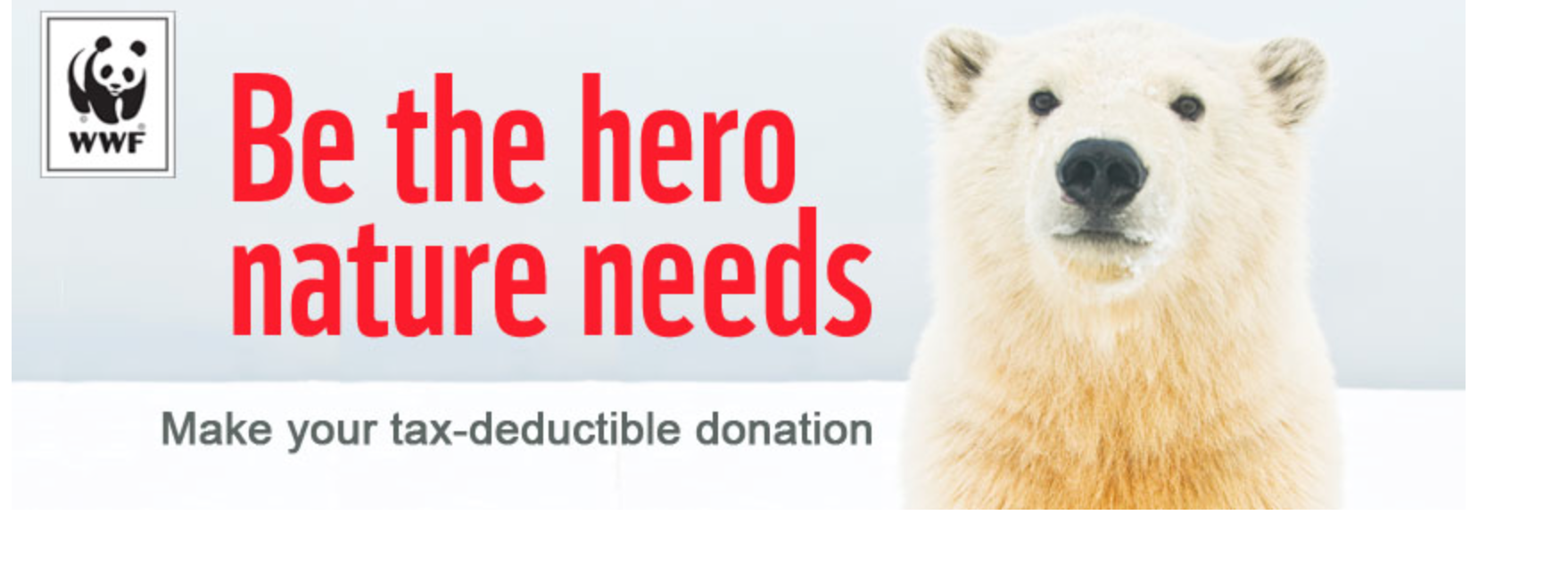
The World Wildlife Fund’s donation page has a terrific image and header.
And take a look at Charity: Water’s actual home page – above at the top of this post.
I love this language on the donation form – you gotta admit that it’s powerful!!
Donate to charity: water
100% of your money will fund clean water projects for people in need.
Bottom Line:
Your donation page may be the most important page on your entire site.
Make it work FOR you – not AGAINST you.
Make it welcoming to your donor – and you’ll be rewarded with her generosity!